
THE BRIEF
To create a store that was to a go to place for wellness needs that offered a lifestyle environment for both wellness and prescriptive products.
THE CONCEPT:
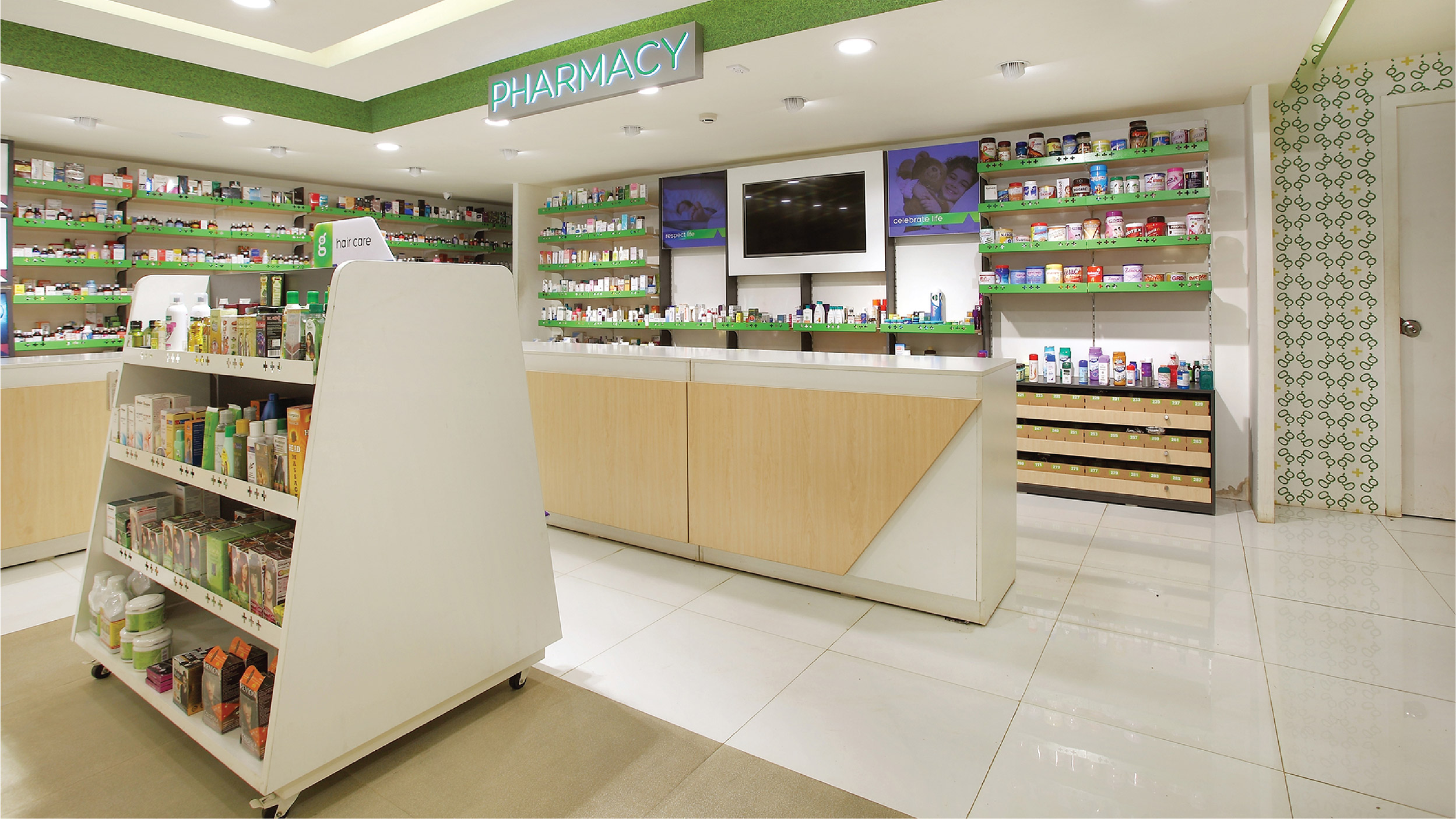
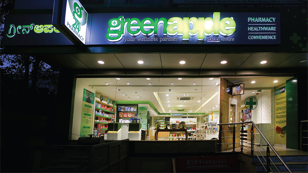
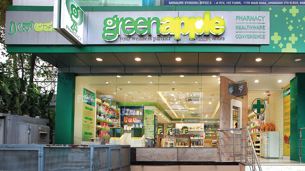
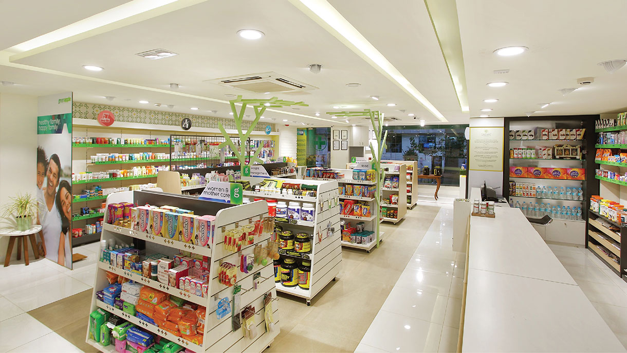
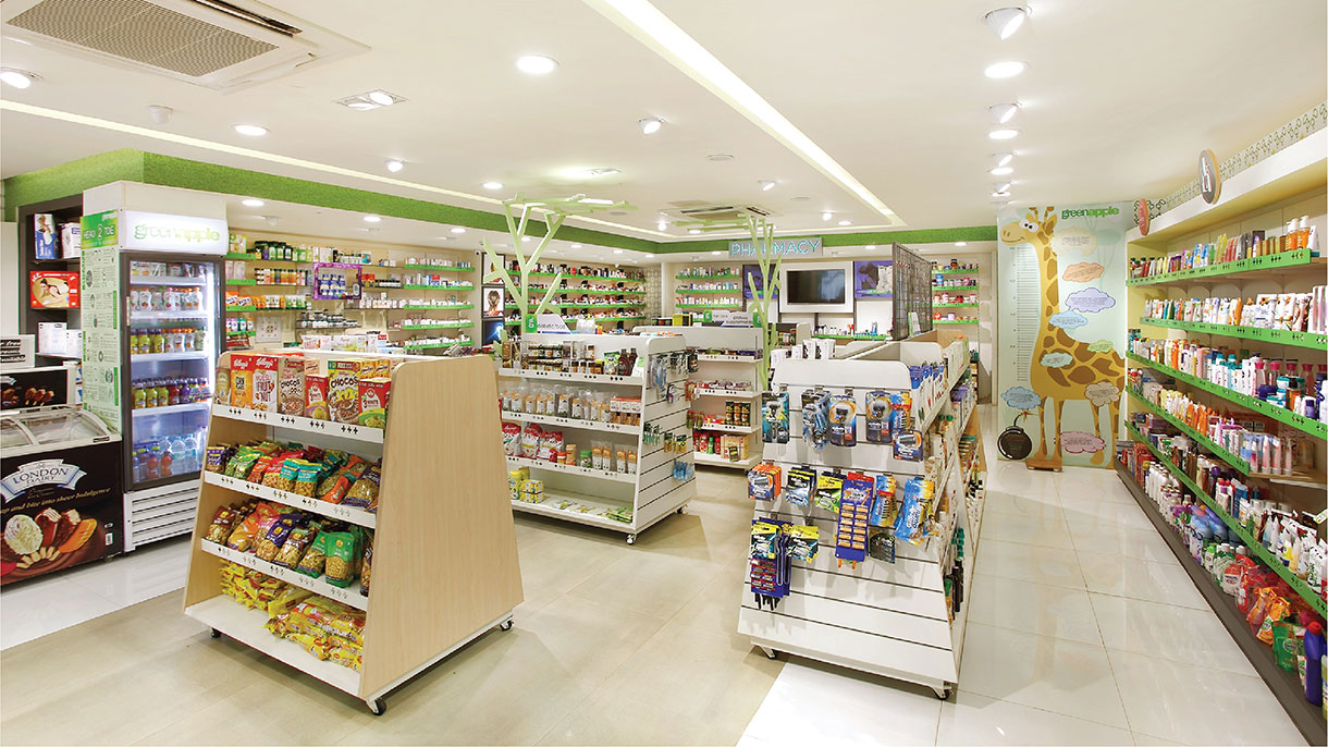
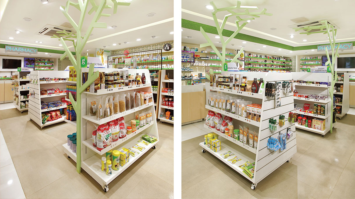
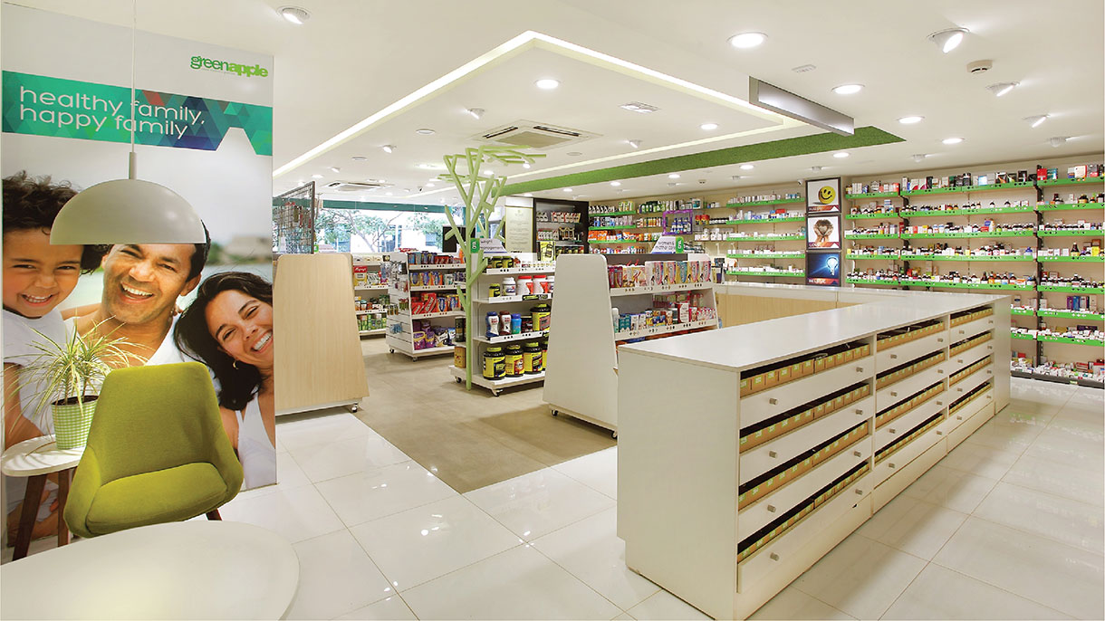
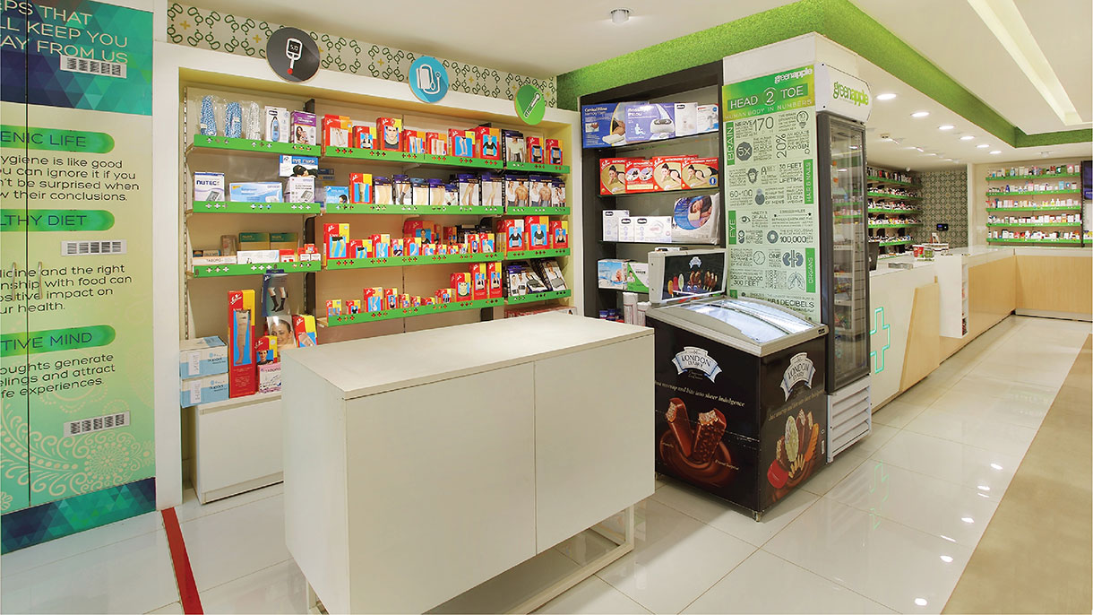
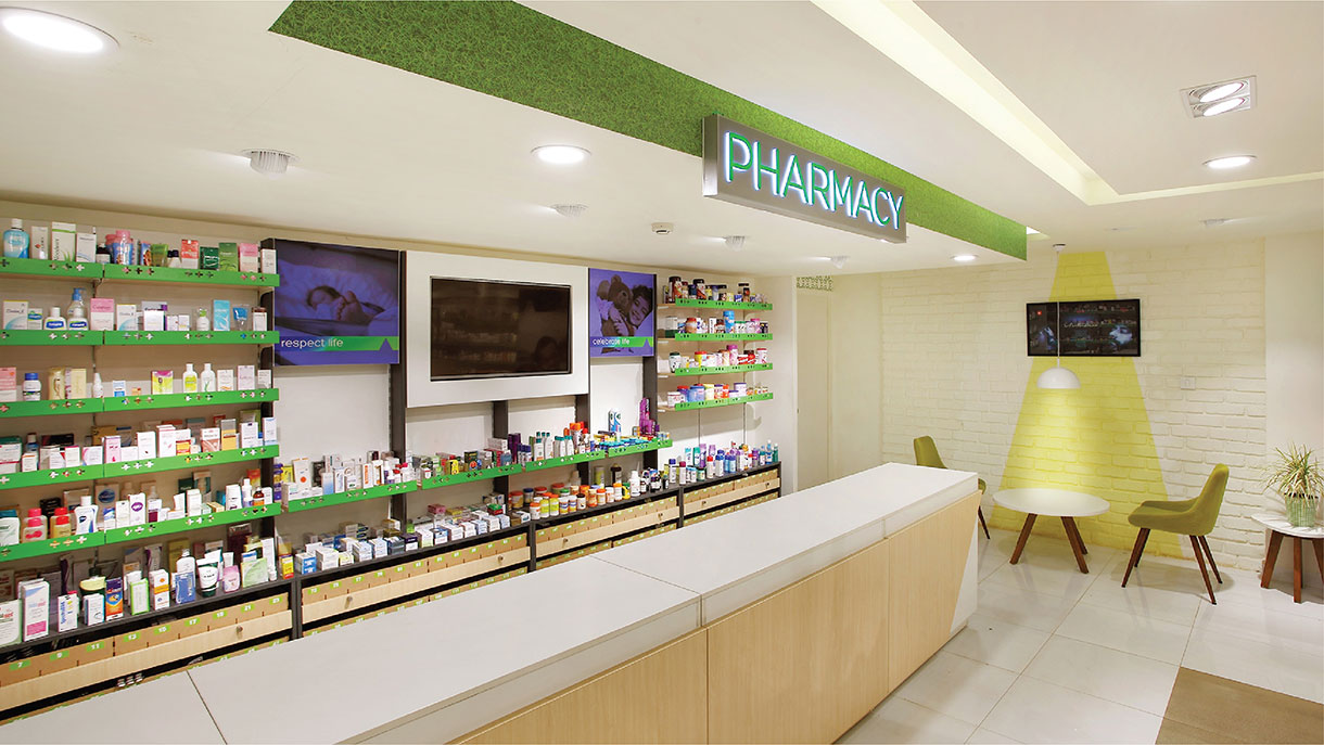
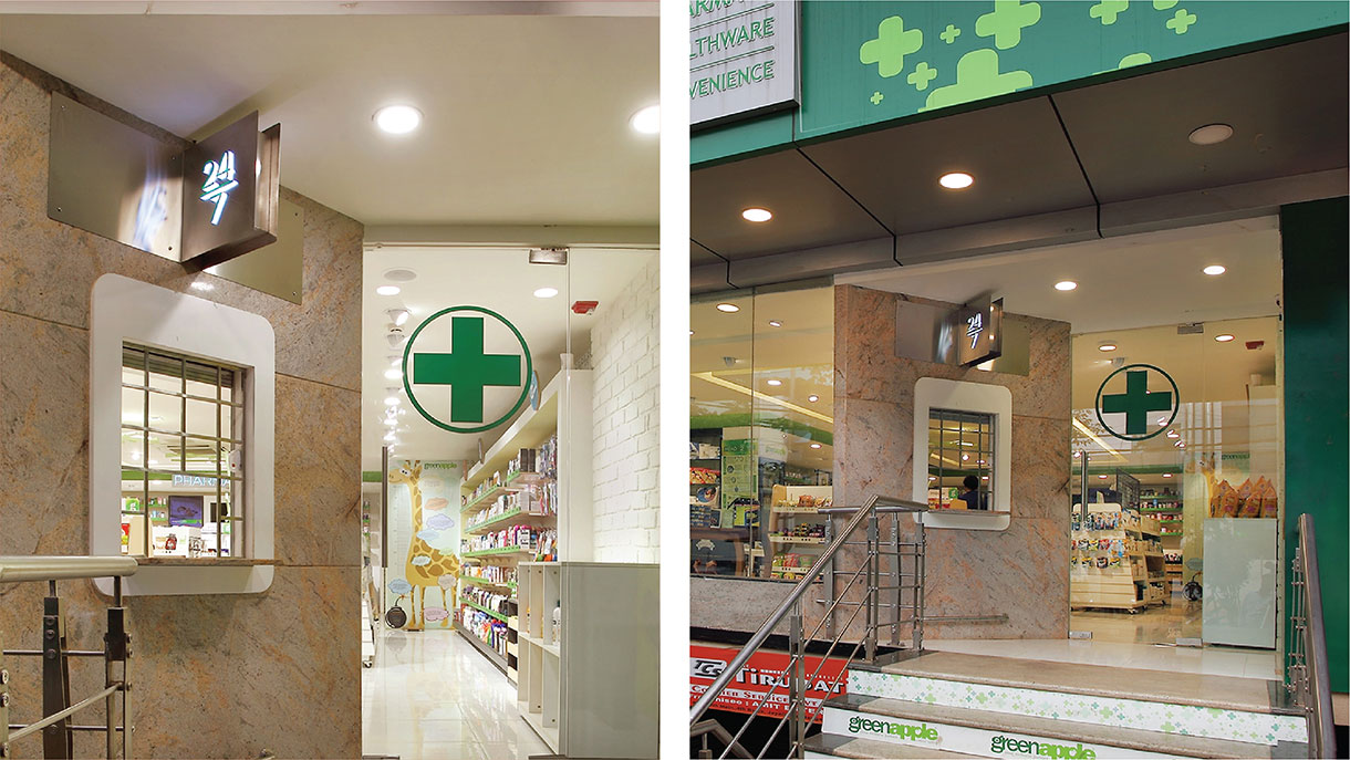
The concept was created using visual cues from lifestyle shopping environments in terms of colors, forms and interior material palette. The design language was purposefully decided with the core objective of breaking away from conventional pharmacies that looked serious, medicinal and transactional. The core color palette of green and white with light wood accents was derived from the brand colors.
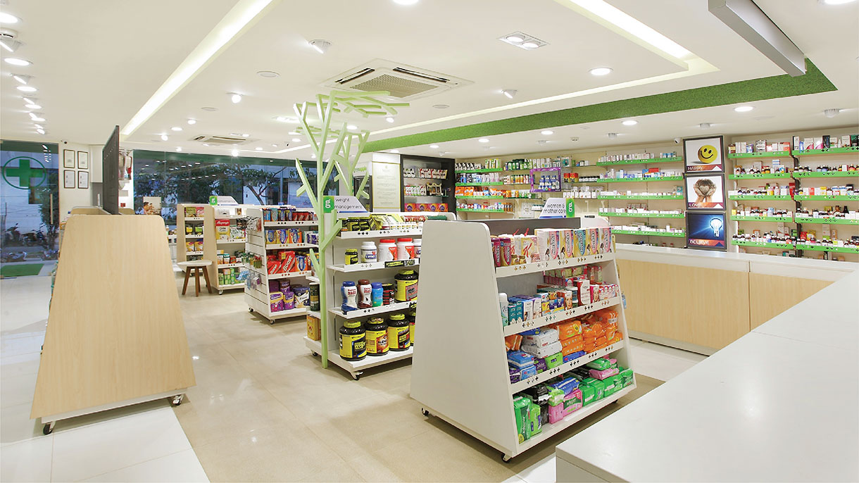
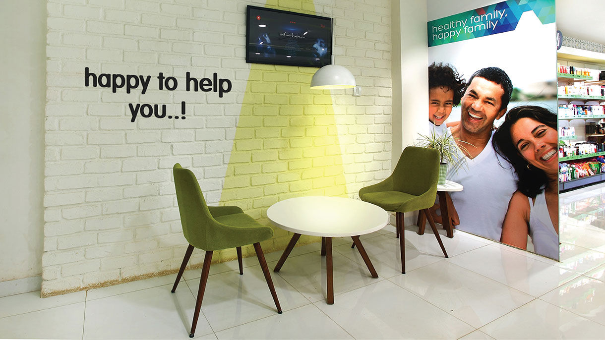
The store layout was designed in 3 zones –Wellness, Prescriptive and Consultation. The first is an open well-organized and self-served presentation of vitamins, supplements and food that helped in managing a health life. The second is the over-the-counter prescriptive medicines area, the pharmacy. Adjacent to this is the Consultation seating area where customers can chat with doctors or pharmacists for advisory chats.
The interior design, furniture and messaging is designed to create a calm and relaxing environment for both the core customers- the health-conscious browser and the unwell. The lighting plays a significant role in creating the required ambience. Green tree inspired forms in the environment add a quirky signature that helps add a much-needed quotient of fun in the shopping journey for this serious product category.
SCOPE OF WORK
New retail store identity, façade and interior design, visual merchandising and visual communication, adapt it into an empty shell and supervise the realization of the design on site.
Store Size: 1400 Sft
Location: Bangalore, India